A cereal box in a Trader Joe’s aisle asked me to scan it last spring. Not for a coupon. For a mini AR game that unlocked a discount code after thirty seconds of tilting my phone around a cartoon bear. I did it. I felt slightly ridiculous, and then I felt the exact same dopamine hit I get from a bonus round loading on a slot app. That’s not a coincidence. That’s inheritance.
Packaging designers have spent the last two years chasing “interactivity” as a buzzword in every trend report, VistaPrint’s 2026 packaging survey included, which pulled data directly from its global freelancer community and flagged AR overlays and layered unlock experiences as the thing every brand wants now. What almost nobody in that conversation says out loud is where the reward-unlock pattern actually got refined. That reward-unlock pattern was polished for years inside the mobile casino before a single CPG brand touched it. Slot developers were A/B testing scan-triggered bonus reveals, tactile-feeling buttons, and near-instant gratification loops back when most packaging was still asking people to peel a sticker and mail in a UPC code.
This isn’t a stretch. It’s an overdue credit.
The Scan-to-Reveal Pattern Has a Longer History Than QR Codes
Connected packaging, the layer of QR and NFC tech now showing up on everything from oat milk to sneaker boxes, is having a real moment. QR Insights’ 2026 connected packaging guide reports that nearly half of surveyed brands now run QR and NFC together on a single SKU, up sharply from where the category sat two years earlier. The stated goal is almost always the same: turn a static object into an interactive one, and reward the interaction fast enough that the shopper doesn’t lose interest mid-scan.
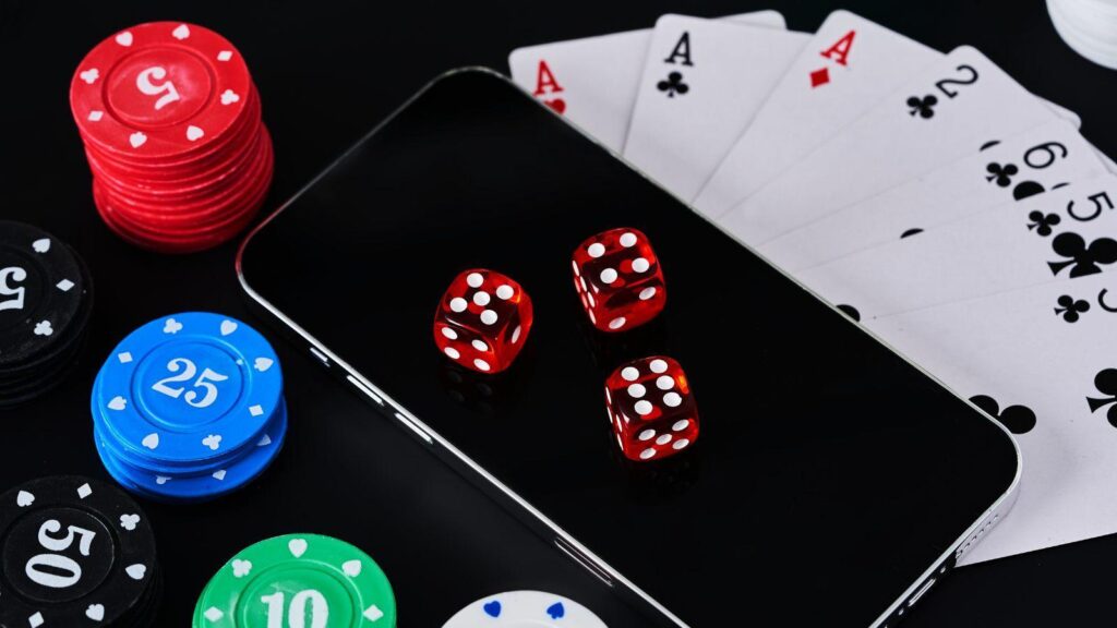
Mobile casino developers solved that exact problem years ago, just without anyone in the packaging world watching. Scan a promo code, unlock a spin. Tap once, get a reward within milliseconds, not after a loading screen that makes you regret bothering. The entire architecture of “low-friction action, high-speed payoff” that connected packaging is racing to build was already load-tested at scale by slot studios and app UX teams working with real money on the line, where a two-second lag genuinely costs conversions.
I’ve spent enough time inside both worlds to say this plainly: packaging designers building their first AR unlock layer this year are, whether they know it or not, following a UX rulebook written by people who spent a decade optimizing how fast a reward feels earned.
Tactile-Feeling UI Didn’t Start on a Cereal Box Either
Here’s where it gets interesting for anyone who actually designs the physical object.
Good packaging now tries to feel tactile even on a flat screen. Soft shadow states on a “peel here” button. Haptic-style micro-animations when a QR scan registers. A subtle bounce when a discount unlocks. None of that vocabulary is native to packaging. It’s lifted, almost verbatim, from slot and casino app interfaces, where every tap needed to feel physically satisfying because there was no physical object at all. Reel stops, coin cascades, the little shimmer on a winning line. Designers had to manufacture tactility out of nothing but pixels and timing, years before packaging needed the same trick to make a QR scan feel like more than reading a barcode.
MIT anthropologist Natasha Dow Schüll spent years studying exactly this kind of engineered feel in gambling machines, documenting it in her book Addiction by Design, which remains one of the most cited academic accounts of how deliberately these interaction patterns were built. Schüll’s research, also discussed in a New Republic interview on the psychology of slot machine engagement, makes the case that the industry didn’t stumble into these mechanics by accident. Every micro-delay, every payoff animation, was iterated on with the same rigor a packaging team now brings to a shelf test.
That’s not an endorsement of the addictive design itself. It’s a fact about lineage. The craft got refined somewhere with enormous financial pressure to get it right immediately, and packaging is now the industry catching up.
What This Actually Means for a CPG Redesign Brief
So what do you do with this if you’re the one sketching the next connected packaging concept for a client?
Start with color, because the research backs it up hard. A systematic review published via NCBI/PMC on packaging color and consumer perception found that specific hue and saturation choices measurably shift how healthy or premium a product feels before a shopper reads a single word. Slot interfaces exploit the same principle constantly. Gold accents signal a jackpot state. Cool blues signal a calm, low-stakes lobby. That’s not decoration. It’s a deliberate perceptual cue, and packaging designers are only now building color systems with that level of intent.
Then look at speed of payoff. FoodNavigator-USA reported on gamified packaging campaigns that saw meaningfully higher repeat scans when the reward loaded in under two seconds versus five. That threshold isn’t arbitrary. It’s the same latency budget mobile casino UX teams have been designing against for the better part of a decade, because a slow bonus reveal in a slot app gets abandoned mid-session.
A few concrete borrowings worth stealing outright:
- Instant visual confirmation the scan registered, before the reward even loads
- A brief, deliberately engineered delay (not too short, not too long) that makes the payoff feel earned rather than automatic
- Layered reveals: unlock a small thing first, tease a bigger thing behind it
- Sound or haptic cues on mobile, even for a packaging-linked experience
None of this requires reinventing anything. It requires admitting where the pattern library actually came from.
The Credit Gap Nobody in Packaging Wants to Name
I get why nobody wants to cite a slot app in a packaging trends deck. It’s not a great look next to sustainability messaging and recyclable substrate specs. But pretending the interaction language sprang fully formed out of AR toolkits and QR generators is its own kind of dishonesty, the same way slot design has quietly leaned on decades of card-game and fruit-machine iconography without most players noticing the borrowing either. Jasminetype’s own look at how slot themes shape perceived chance gets at a related point: the feeling of an experience is engineered long before the player or shopper ever clocks it as engineered.
Designers chasing the next packaging trend cycle would do better work faster if they studied slot and mobile casino UX directly instead of reverse-engineering it through a packaging trade report two steps removed from the source.
FAQ
Why does packaging design keep borrowing from gaming apps specifically? Because gaming apps, casino ones especially, have spent years under direct commercial pressure to make reward mechanics feel instant and satisfying. Packaging is now trying to replicate that same reward psychology through QR and NFC layers, so it makes sense the underlying UX patterns transfer directly.
Is this the same thing as gamification in retail? Related but narrower. Retail gamification is a broad umbrella covering loyalty points and challenges. What’s being borrowed here is more specific: the exact timing, animation, and payoff structure slot interfaces use to make a single interaction feel rewarding within milliseconds.
Do consumers actually notice the difference in packaging design quality? Yes, even unconsciously. Research on packaging color cues shows shoppers form quality and health judgments before reading any text, and the same principle applies to interaction speed. A sluggish scan-to-reward experience reads as cheap even if the shopper can’t articulate why.
Should smaller brands bother with connected packaging if they can’t afford custom AR? A simple, fast QR unlock with a clean payoff beats an ambitious AR layer that lags. Speed and clarity of reward matter more than technical complexity, which is exactly the lesson slot app UX learned the hard way first.
Where should a freelance packaging designer go to actually study these mechanics? Spend time inside a real mobile casino app, not a case study about one. Watch the timing between action and reward, note the color shifts between states, and pay attention to how little visual noise surrounds the moment something unlocks.
The next packaging brief that lands on your desk asking for “more interactivity” deserves better than another QR code bolted onto a box out of habit. The reward-unlock language already exists, fully tested, in an industry that’s been refining it under real financial stakes for years. Borrowing it on purpose, and crediting where it came from, is the difference between a trend piece and a genuinely useful redesign.
Gambling involves risk. Please play responsibly and only wager what you can afford to lose. If you feel gambling is becoming a problem, visit BeGambleAware.org or call 1-800-GAMBLER.